I explained the symbolism of my painting "Terra Australis Magnus" (Great Southern Land) in another post. Here, I'm going to explain how the idea came about, and how I went about creating it.
I'm a member of a Facebook group called "Change the Aussie Flag", which is a group of people trying to come up with alternative designs to replace the current Australian flag. A lot of Australians feel strongly about the need to remove the British Union Jack from their national flag. (In fact, the original name of the group was "*JACK OFF*get the UNION JACK off Our Flag.")
I contributed the following design that I called "Timeless Red Earth". I created it using SVG (Scalable Vector Graphics), which I find to be a very pleasurable tool to use. It's amazing what wonderfully appealing visual designs can be created using just a text editor and some math-based graphical elements.

"Timeless Red Earth" - my proposal for a new Australian flag
Compare this to the current flag (below). I replaced the Union Jack with an Aboriginal motif because I felt any Australian flag should acknowledge the original inhabitants of the land. (See my pre-emptive note on "cultural appropriation" here.) I didn't think the Federation Star under the Union Jack was necessary. I retained the Southern Cross constellation on the right but changed the style of the stars to make it appear a bit more modern (I thought the conventional look was dated).
I also changed the aspect ratio (length/width) from the current 2:1 to the Golden Ratio (approximately 1.618).
Overall, I thought this design was less cluttered than the current one, and also provided the right degree of antisymmetric tension and balance.

The current Australian flag
I was inspired to use a brownish red background because I was strongly impressed by the cover of a Lonely Planet book on Australia that I had bought in India before I migrated in 1998.
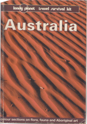
Red sand dunes - This wouldn't have been my impression of Australia before I moved to the country. I had a more conventionally stereotyped view involving the Sydney Opera House and Harbour Bridge.
Since I hadn't associated Australia with red earth before, this cover struck me as pretty unusual. Then I saw this red earth for myself when I visited Uluru and Alice Springs (the "Red Centre") in 2007, and it made a strong impression.
One of the oft-heard sentiments on the "Change the Aussie Flag" group was to use authentically Australian themes and motifs, so a background corresponding to the colour of Australia's red earth seemed more appropriate than the European/American blue. It was, quite literally, of this earth.
One of the oft-heard sentiments on the "Change the Aussie Flag" group was to use authentically Australian themes and motifs, so a background corresponding to the colour of Australia's red earth seemed more appropriate than the European/American blue. It was, quite literally, of this earth.
In November, I got into painting when I was inspired by a friend's wall art. I blogged about it too. That was a pleasant experience, and I thought I should do more painting.
I guess I'm not a conventional artist, though. I do a fair bit of cartooning, and although I had done some oil painting in my youth (ages 17-20), those were all of fighter planes and tanks. "Real" art bores me. I'm drawn to off-beat themes and prefer designs with some mathematical or geometric basis. That was when I remembered my flag design, and decided to render it on canvas. Since it was going to be a painting and not a flag design, it didn't have to restrict itself to simple lines and shapes.
One aspect that troubled me about Timeless Red Earth was that stars should rightly have a blue or black background. I wasn't entirely happy about drawing stars against a background of red earth.
SVG made it very easy to see what it would be like to have half the canvas in blue.

Slightly better in some ways, but dark colours like red and blue should never touch
It's a vexillological principle that there has to be a light colour or a "metal" (silver/white or gold/yellow) between two dark colours (e.g., red and blue). Something like this.

It still looks too much like a flag. A painting can afford to be more elaborate.
That's when I thought I could use an S-curve rather than a straight line.
The figure would still be radially symmetrical, and yet the design would be a little more elaborate.
What light colour could I use between red and blue? Obviously something with white and yellow in it. It would have to follow the path of the S-curve.
The Aurora Australis (the Southern Lights) immediately occurred to me.

The Aurora Australis - I would like to see this for myself some day
With this, my design was conceptually complete. I "just" had to transfer it from my head on to canvas.
Now to buy some canvas. I'm sold on the idea of the Golden Ratio, and I prefer to use that as the aspect ratio for most of my work. I went down to the local art shop to look for a suitable canvas.
These were the sizes they had.

They had arranged the canvas sizes in increasing order of area (and price), which made sense. But it made my job of calculating their aspect ratios difficult.
I took a photo of this chart, then went back home to put them into a spreadsheet and calculate their aspect ratios. This is what I found.

Only one of the standard canvas sizes came anywhere close to the Golden Ratio of 1.618. This was a fairly large canvas of length 48" and width 30".
[When I went back to the art shop armed with this information and asked for the 48-by-30 canvas, the lady in charge told me they didn't have it. I was about to turn away disappointed when she added, "They don't even make that size!" I at once told her that it was listed on her price chart, and she demanded that I show her. When I pointed it out, she exclaimed, "Oh, you mean 30-by-48!"]
Before I committed to painting on such a large and expensive canvas, I thought I should test out specific elements on smaller canvases. That way, I could learn from my mistakes and do better on the main canvas. I bought two 14" x 14" canvases for the Aboriginal Sun and Southern Cross, and a rectangular one of 18" x 14" for the Aurora Australis, as sacrificial trials.
And that turned out to be a very good decision, because I did make a few mistakes.
I first printed out a greyscale version of the Southern Cross on A3 paper...

Fun fact: Since the stars are created out of the "negative space" between four quadrants of a circle of radius 'r', the area of each such star is (4 - π) r2, since it's the area of a square (4r2, which is (2r)2) minus the area of a circle (πr2).
... and a greyscale version of the Aboriginal Sun on A2 paper. I got these done at Officeworks, since A2 is not a supported size in regular printers.

Then I made some stencils from them, using plastic sheets and a "cutting compass" (a pair of compasses with a blade instead of a pencil). (A big thank-you to the kind lady at Officeworks who gave me some leftover laminating sheets that I could use.)

Measure twice...

...and cut once.
I had to create two sets of stencils for the Aboriginal Sun.

The first set was for the large rings. The outer and inner rings had to be traced out using two separate pieces of plastic. I had to "MacGyver" a handle for the inner one to hold it in place and lift it conveniently.

The second set was for the circles. This is the stencil after it had been used, as one can tell.
Sure enough, I made mistakes. This is how the Southern Cross turned out.

It's not obvious here, but I had to do a lot of manual repair work after using the stencil.
The Aboriginal Sun turned out to be quite messy, mainly because I didn't know how to use a stencil.

It may not look bad overall, but I was hoping for more precisely drawn circles. And the background looks more like wood than like sand dunes.
Finally, the Aurora Australis ended up looking like a straight line.

If the width of the canvas isn't large compared to the width of the Aurora, the S-curve begins to look like a straight line. The red sand dunes are still not great, but I'm learning.
When creating the Aurora Australis, I also had the idea to use grey strokes on the upper side of the Aurora to symbolise gum (eucalyptus) trees, since these are also an Australian icon.
Specifically, the stencils weren't giving me the sharp outlines I was hoping for. I didn't realise why at the time. I thought I needed stencils that would stick to the canvas enough to prevent paint from seeping under them. The only material I could think of that would stick to canvas, yet peel off easily, was Blu Tack. So I MacGyvered my own stencil using Blu Tack, by first building up a thicker star shape, then moulding the Blu Tack in strips around this.

From left to right: a star cut out using the cutting compass; a thick star shape built by sticking 6 such stars together with super-glue; Blu Tack moulded around this more solid star, forming a stencil that would stick to the canvas.
Armed with confidence from these learnings, I then began work on the big canvas. I used a "drop sheet" from Bunnings hardware store to protect my floorboards from stray paint.

The S-curve was drawn freehand, which accounts for its less-than-mathematical precision. I didn't mind because the Aurora was going to be jagged and irregular anyway.

While the pure black background of the Southern Cross in my trial canvas didn't look bad, I still wanted a bit of blue, so I added it in. However, much of this got obscured by the Aurora.

The background is now complete!
Using my Blu Tack stencil, I got better results than during my trial.

The stars now have sharper edges than before.
The Aurora now retains its S shape, and the trial also taught me some techniques to improve its appearance.

Major learning: create the Aurora using two passes. In the first pass, use green along the middle line of the Aurora and spread it uniformly to both sides (up and down). In the second pass, use yellow and white on the bottom edge of the Aurora and spread it upwards.
For the circles of the Aboriginal Sun, I gave up on using a stencil and thought I would need sponge brushes of a circular cross-section. I had seen these at the art shop, so I went back there to ask about them. It was a good thing I did, because the owner told me I was using the stencils all wrong. I should not have used regular brushes with stencils. There are special stiff-bristled brushes called "stencil brushes". They're supposed to be used dry, with a minimum of paint, and applied in repeated vertical jabs onto the stencil rather than in horizontal strokes on the canvas. She also advised me to place a thick towel or other cloth under the canvas to hold the sheet in place so it didn't move (sag) under all that jabbing. So I bought a couple of stencil brushes, and these worked out magnificently for the circles, with just a little bit of manual repair necessary afterwards.
The Aboriginal Sun was the most pleasing of all, compared to its counterpart during the trial.

The use of stencil brushes made the outlines of the circles much sharper. It was almost like the entire image had been printed on top of the background.
And that's the final picture!

To give you an idea of the actual size of the canvas...

You can see my earlier painting "Locutus" in the background. Check out the story here.
To close the circle, I created a new flag design based on this painting.

I would now like to thank...

The Aurora Australis is now a green-and-gold sash through the middle of the flag
I would now like to thank...

My warm colours, ...

... my cool colours, ...

... and the indispensable black and white, ...

... my brushes (the two at the top with stiff bristles are the stencil brushes), ...
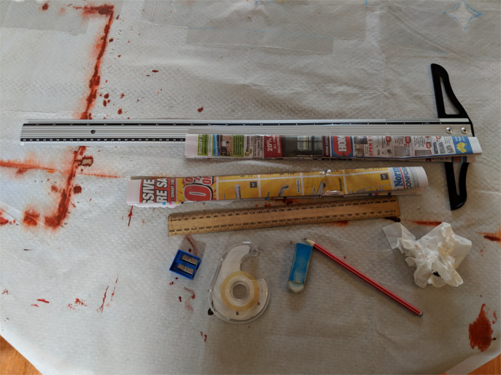
... and other instruments. I have previously mentioned the cutting compass, stencil sheets and Blu Tack.
And that is the story (the why and the how) behind the creation of Terra Australis Magnus. Thanks for reading!
No comments:
Post a Comment